Rebranding Website Experience to Drive Growth
Overview
Foresight’s marketing site is a critical component in supporting business growth and advancing the mission to make mental healthcare more accessible nationwide. We redesigned the site as a scalable, CMS (Content Management System)-powered platform that serves as the foundation for the brand launch. The new site helps drive member acquisition, attract providers, and align efforts across teams.
Responsibility
Co-Lead Product Designer (UX/UI) — Discovery, IA, Wireframing, Prototyping, UI/Visual Design
Collaborators
Project Lead, Product Designers, Sr. Copywriter, Visual Designer, Marketing Teams, Third-party website hosting platform, Outsourced engineering team
Duration
MVP Launch: 3 months
Challenge
The previous website created friction for users due to poor navigation, limited scalability, and an outdated brand presence, which led to reduced engagement and fewer new member sign-ups.
Impact
21% increase in new member conversions
15% drop in bounce rate
Scalable CMS now supports 50+ locations across 15+ states
Discover
User
The website serves as a key entry point for prospective members and providers, most of whom discover Foresight through platforms like ZocDoc, Psychology Today, or search engines.
Potential Member

Look for clear, trustworthy information about mental health services and how to get started with care
Potential Provider

Explore clinical roles and want to understand Foresight’s mission, values, and benefits
User Problem
Encountered friction due to unclear navigation, limited scalability, and an outdated brand presence, leading to reduced engagement and difficulty accessing key information
Research
Gathering insights
I identified user and business needs through stakeholder interviews, site analytics audits, user flow reviews, and by uncovering operational inefficiencies in CMS content publishing.
Audited the existing sitemap to identify gaps

Current sitemap
Key challenges
The existing website caused user friction and limited growth due to:
Unclear navigation and confusing CTAs led to high drop-off rates, especially on booking pages
Poor mobile experience, despite 73% of traffic coming from mobile devices
Inconsistent brand voice and outdated visual design
Limited scalability to support rapid clinic and content expansion
Inefficient CMS workflows across departments
Key metrics
To measure the success, I identified and set clear, actionable targets. These metrics focus on user engagement, performance improvements, and scalability, reflecting the critical areas that need attention.
Increase new member conversions by 20%
Reduce bounce rate by 15% through improved mobile UX
Launch a scalable CMS to support 50+ clinic locations
Goal
Redesign the marketing site to improve user engagement, support national expansion, and ensure accessibility across devices
Ideation
Restructured sitemap for clarity
The structure of information on the website directly impacts how we deliver information and communicate with each user. The redesigned approach I focused on:

Redesigned sitemap
Streamlined navigation to reduce friction and improve information access
Prioritized clear, actionable CTAs for booking, inquiries, and career applications
Built a modular, scalable framework to support future clinic expansions and content growth
Implemented a headless CMS using Material UI components for flexibility and consistency
Balanced technical constraints with accessibility and ease of use across devices
Prototyping and iteration for scalable UX
Wireframing & Prototyping
Created low to high-fidelity wireframes and validated key flows with stakeholders and users
Component-Based Design
Built reusable UI components to ensure consistency and streamline development
User Testing
Ran usability testing with 10+ participants, refining key flows and content hierarchy based on task success and feedback
outcomes
Final design
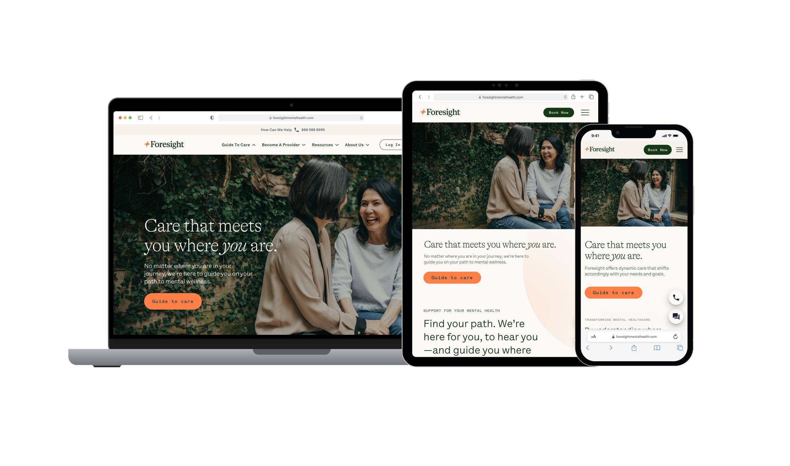
The primary objective of the final UI development was to create a universally functional website across platforms, setting a high standard for quality and positioning Foresight as a tech-forward national brand.
A Scalable, Mobile-First Design That Drives Growth
Before
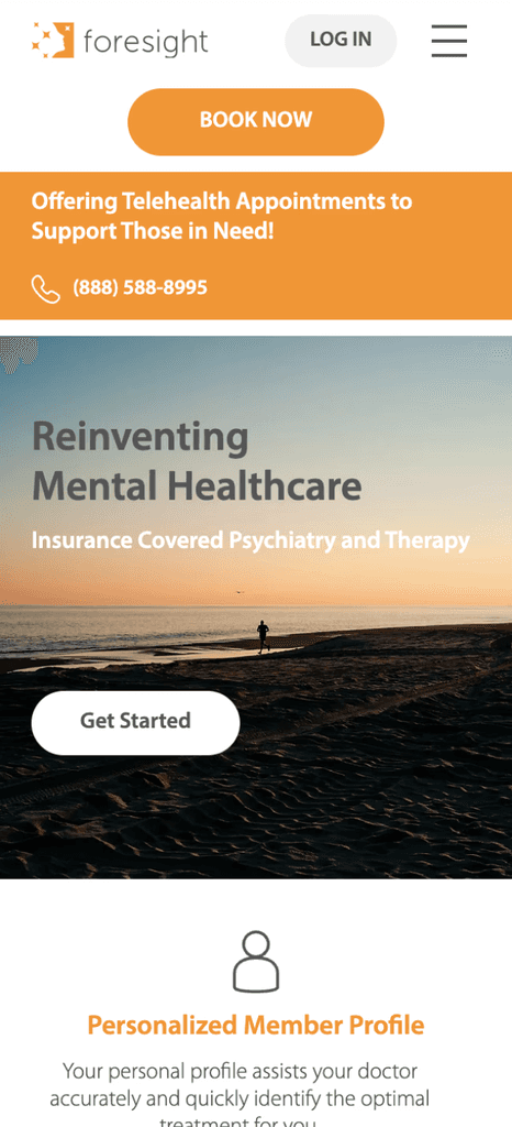
Unclear navigation and scattered CTAs led to drop-offs
Poor mobile experience despite 73% mobile traffic
Outdated brand visuals and inconsistent voice
Manual content updates and limited scalability
Accessibility gaps affecting usability
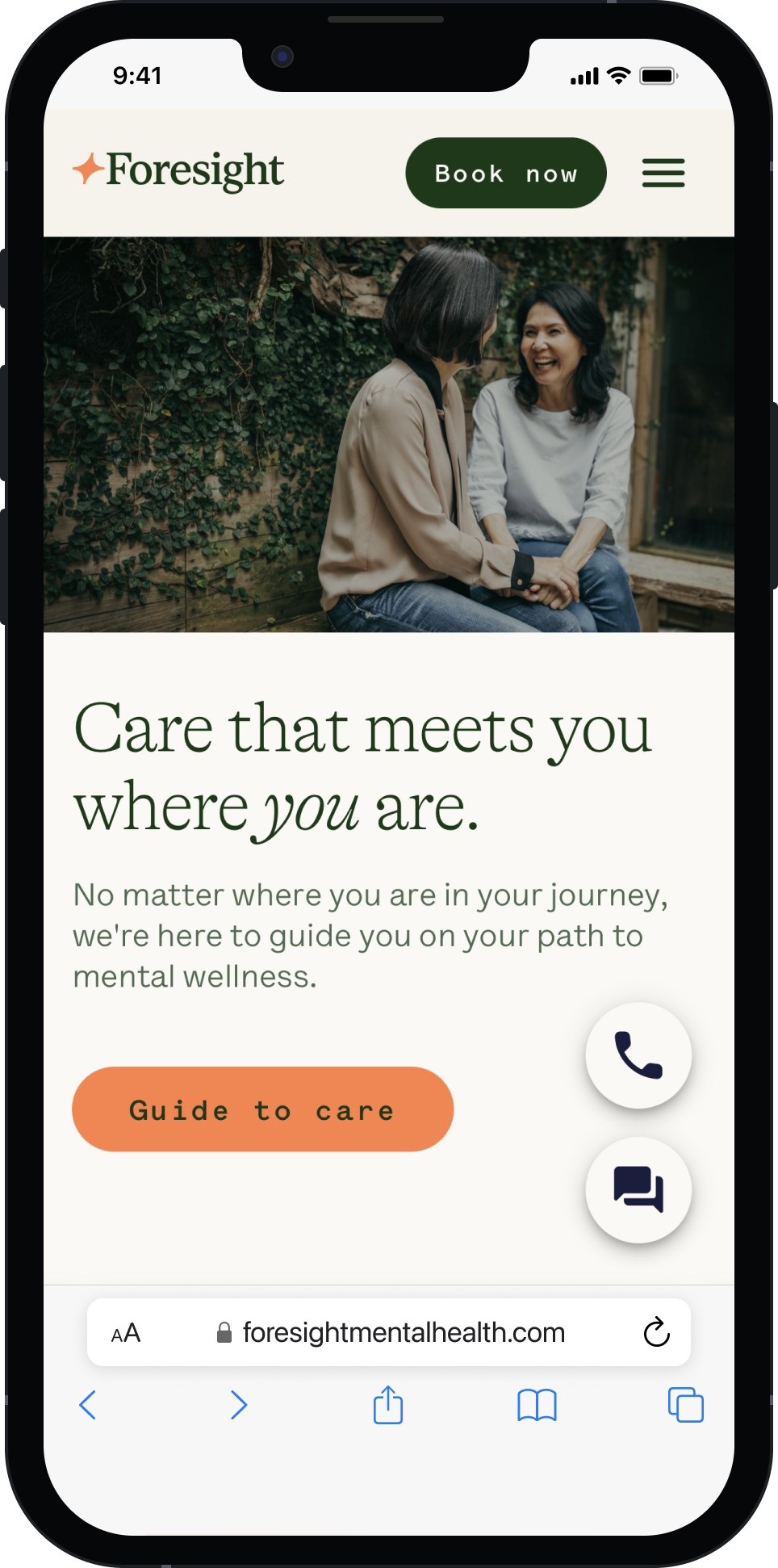
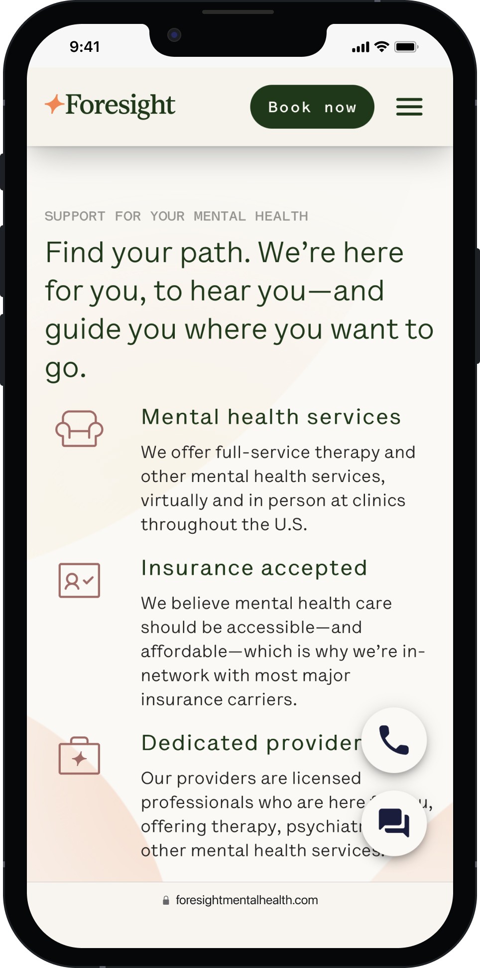
After

Restructured IA and prioritized CTAs to guide users effectively
Mobile-first redesign with responsive, fast-loading components
Refreshed UI with cohesive branding and enhanced storytelling
Scalable headless CMS with reusable components for easy updates
WCAG 2.1-compliant design for inclusive user experience
Home
Service
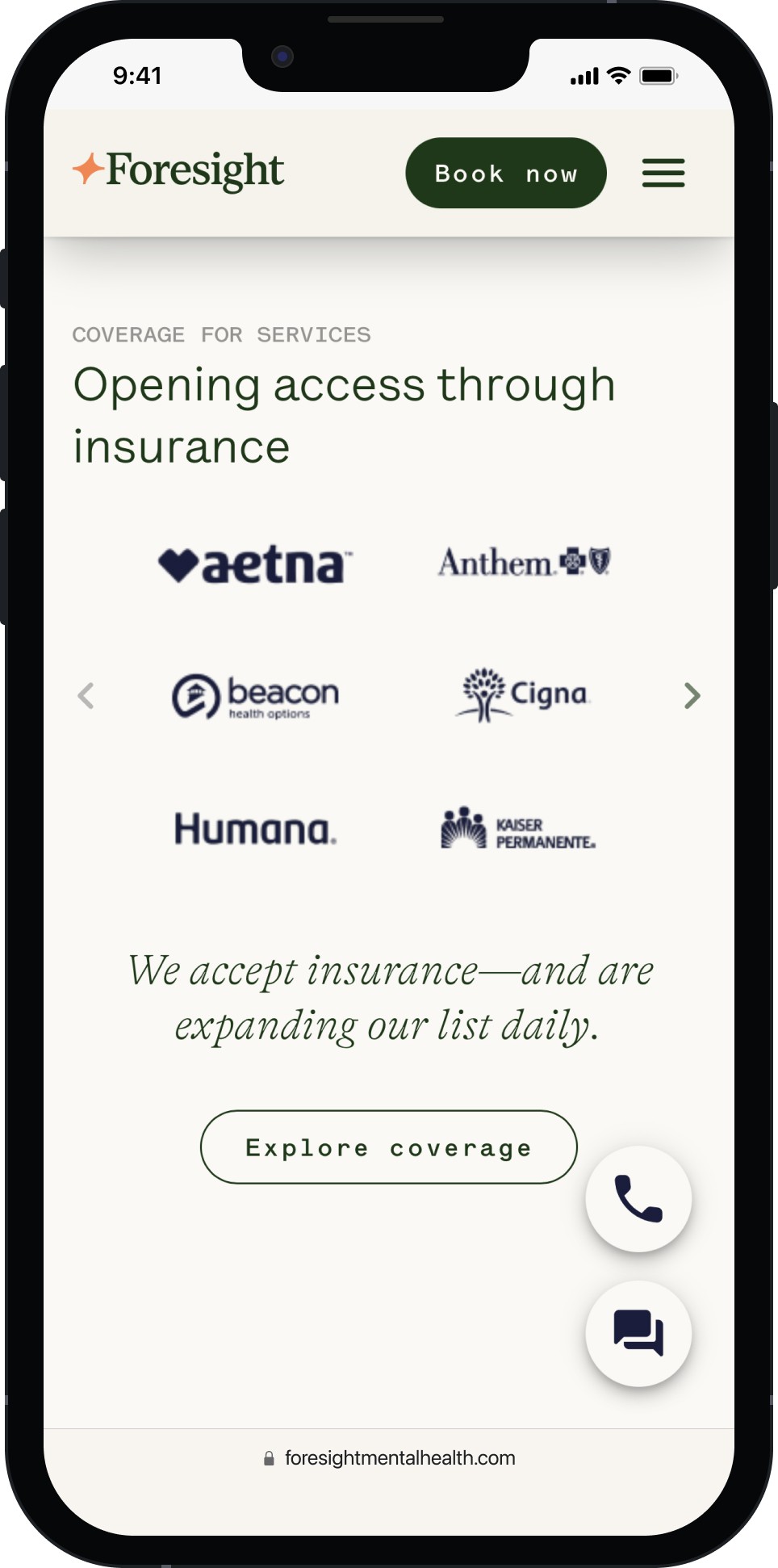
Insurance
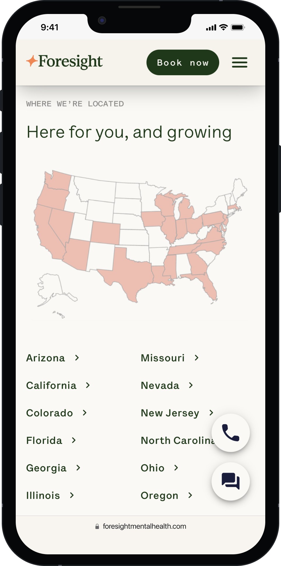
Location
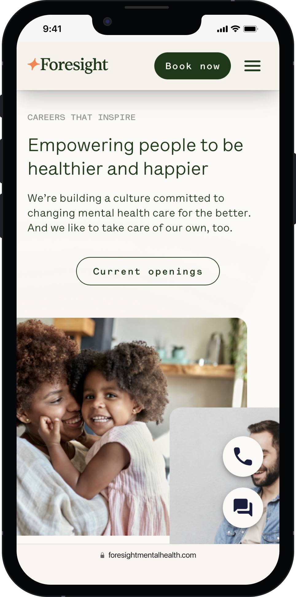
Career
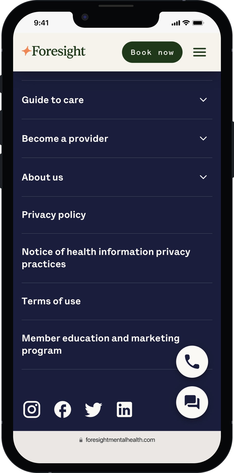
Footer
Impact
The results
21%
increase
in new member conversions within the first 3 months
15%
reduction
in bounce rate (notably on mobile)
50+
locations
across 15+ states made possible through a scalable CMS