Streamlining EHR for Clinical Efficiency
Overview
I led the redesign of Foresight Mental Health’s Electronic Health Record (EHR) dashboard to streamline data access, reduce workflow disruptions, and improve care delivery. Partnering with product, engineering, and clinical stakeholders, I conducted a design audit and user interviews to identify pain points in navigation and information hierarchy.
The new dashboard features a categorized top menu, role-specific layouts, and a focused left panel for critical information. I redefined the information architecture, prototyped layout options, and tested solutions that prioritized high-value data and supported real-time decision-making, ultimately enhancing usability and clinician productivity.
Responsibility
Current Design Audit, User Research, Information Architecture, Wireframing, Prototyping, User Testing
Collaborators
Product Manager
Engineers
Clinicians
Product Designer (me)
Duration
2 months
Challenge
Although the EHR dashboard is key to organizing real-time patient data and enabling personalized care, clinicians struggled to locate critical information due to a cluttered, inefficient interface. This slowed sessions, reduced productivity, and increased the risk of missed follow-ups.
Impact
40% faster data retrieval (5 → 3 minutes)
15% fewer missed follow-ups, enabling more proactive care
Business problems
The existing dashboard's limitations hindered Foresight's operational efficiency and growth:
User Dissatisfaction & Competitive Risk
Poor engagement and clinician frustration weakened retention, harmed reputation, and reduced Foresight’s ability to position itself as a tech-forward provider.
Scalability Issues
The dashboard’s inability to manage growing datasets and complex workflows led to higher maintenance costs and developer strain.
User Problem
Struggle to access critical patient information due to an inefficient EHR dashboard, causing workflow disruptions and delayed patient care.
Research
Gathering insights
User quotes
“I spend too much time searching for basic patient details. It’s frustrating when I can’t find what I need quickly.”
“Switching between different sections of the dashboard feels clunky and slows me down during appointments.”
“I wish the dashboard would highlight key trends or issues without me having to dig for them.”
“If the system was easier to navigate, I could focus more on patient care instead of figuring out the software.”
Identified problems

Inconsistent prioritization: High-value sections like Appointments and Prescriptions were buried, while lower-priority content dominated screen space.
Ambiguous categories: Unclear grouping led to confusion, such as Clinical Notes being mixed with unrelated uploads.
Redundant content: Duplicate sections like Upload Files and Upload Genetic Data created unnecessary complexity.
Poor scalability: The dashboard was not equipped to handle expanding datasets and evolving clinician workflows.
Goal
Redesign the EHR dashboard to ensure quick, seamless access to critical patient information, reducing workflow disruptions and preventing delays in care.
Redefining Information Architecture (IA) for better navigation
Before
IA lacked clarity. Critical sections were buried, categories were ambiguous, and redundant features caused confusion.

After
A streamlined, role-based IA that surfaces high-priority data and simplifies navigation.

Key improvements
Prioritized critical info like medications, intake forms, and flagged risks on the main dashboard
Role-specific views for clinicians and operations to reduce noise and increase focus
Simplified navigation with dropdowns, collapsible menus, and a quick-glance overview
Visual cues (e.g., icons, color, bold text) to highlight urgent tasks and reduce missed follow-ups
This reorganization reduced friction and helped clinicians act faster with greater clarity.
Ideation
Developing concepts through multiple iterations
Key Layout Principles
Strategic Placement
Placed high-priority data (e.g., treatments, alerts) in the top-left for immediate visibility
Row-Based Flow
Structured content in horizontal rows to support intuitive eye movement and reduce navigation effort
Continuous Scanning
Enabled side-by-side views to minimize context switching and support faster comparisons
#1 Cardstack
What Worked: Flexible and responsive across devices
What Didn’t Work: Visual clutter with more than 4 widgets; hard to focus
#2 Top-to-Down
What Worked: Categorized top menu enabled intuitive flow and expandable content
What Didn’t Work: Required clear prioritization to surface key info
#3 Left-to-Right
What Worked: Logical for linear data
What Didn’t Work: Constrained space for detailed content
#4 Dropdown menu
What Worked: Space-efficient overview
What Didn’t Work: Overwhelming scroll; buried critical info
outcomes
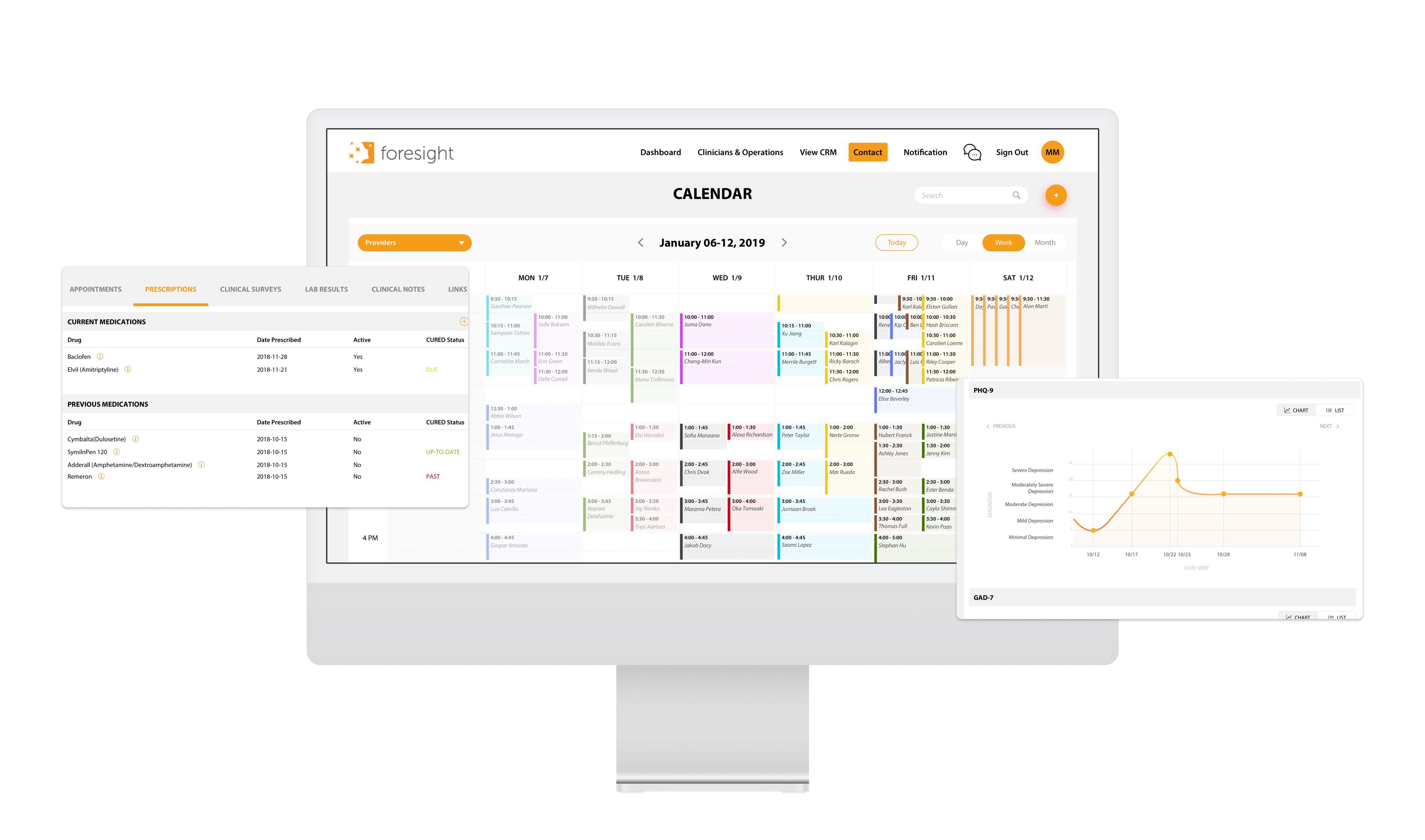
Final design
Optimized Dashboard for Clarity, Focus, and Speed
Categorized Top Menu – A single-row menu for easy browsing of categories and support for role-specific views.
Maximized Content Space – Expanding sections upon category selection display detailed data without overwhelming users.
Enhanced Left Panel – Highlights high-priority sections like patient information, medications, intake forms, and urgent tasks to reduce search time and improve efficiency.
Selected screen
Appointments Page

Clinical Survey Page

Impact
The results
40%
faster data retrieval
decreased search time from 5 to 3 minutes
15%
fewer missed follow-ups
leading to more timely patient care.
What I leanred
Design for Scale, Not Just the Moment
I learned to think systematically beyond short-term fixes. By focusing on scalable architecture and asking the right questions early, I prioritized features that aligned with user needs and long-term growth.
Words Matter in UX
While finalizing the design, I saw how thoughtful UX copy shapes the user experience. Clear, empathetic language reduced confusion, built trust, and guided users through tasks with confidence.