Optimizing Payment System
Enhancing billing team efficiency by implementing optimized payment workflow to increase productivity, security and revenue
My Role
End-to-end process (Research, Define problems, Ideation, Wireframing, Prototyping, Testing, Visual Design)
Team Members
Sr. Product Manager
Engineers
Designer (that's me!)
Duration
6 months
Platform
Web
Context
About
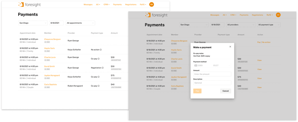
This is a redesign of the payment processing experience for billing team members. Our goal was to streamline the payment process with Stripe integration to enhance user productivity.
Results
$1M revenue collected in the first-month post-launch
98% copay collection rate achieved
User Problem
User productivity decreases due to an inefficient payment system.
Key User Insights
Operators spent 10 minutes per claim fixing errors caused by:
Manual double data entry (handling ~1,000 claims daily)
15% of transactions fail due to invalid credit card information
Business problems
FMH loses members due to diminished trust and a low payment collection rate could put the business at risk.
Revenue leakage and decreased trust
Compliance gaps and data security risks
40% of payment errors caused by manual claim input
Solution
Streamline payment process to enhance user’s work efficiency
Optimized payment workflow
Reduced from 6 steps to 2 by eliminating manual processes and syncing data
Automated credit card validation to prevent double data entry
Enabled in-portal payment processing for operators
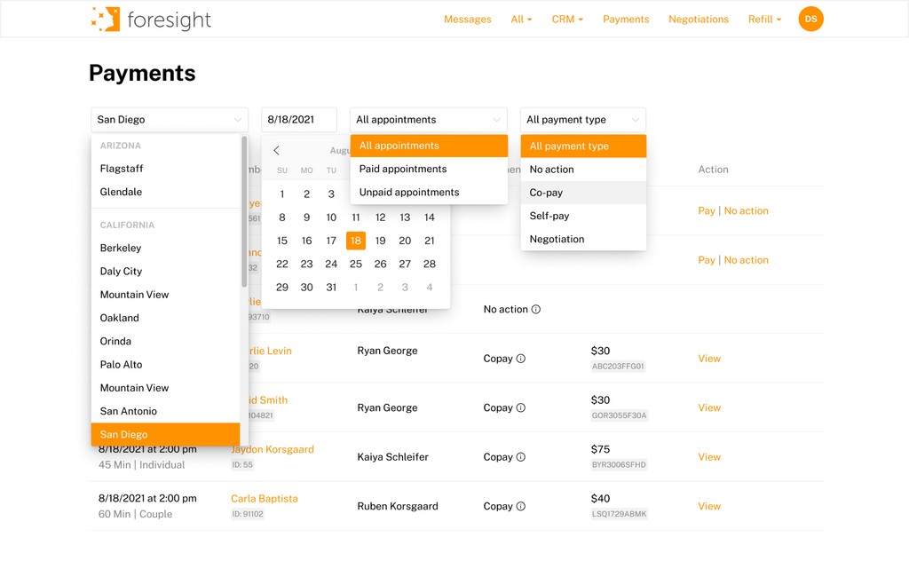
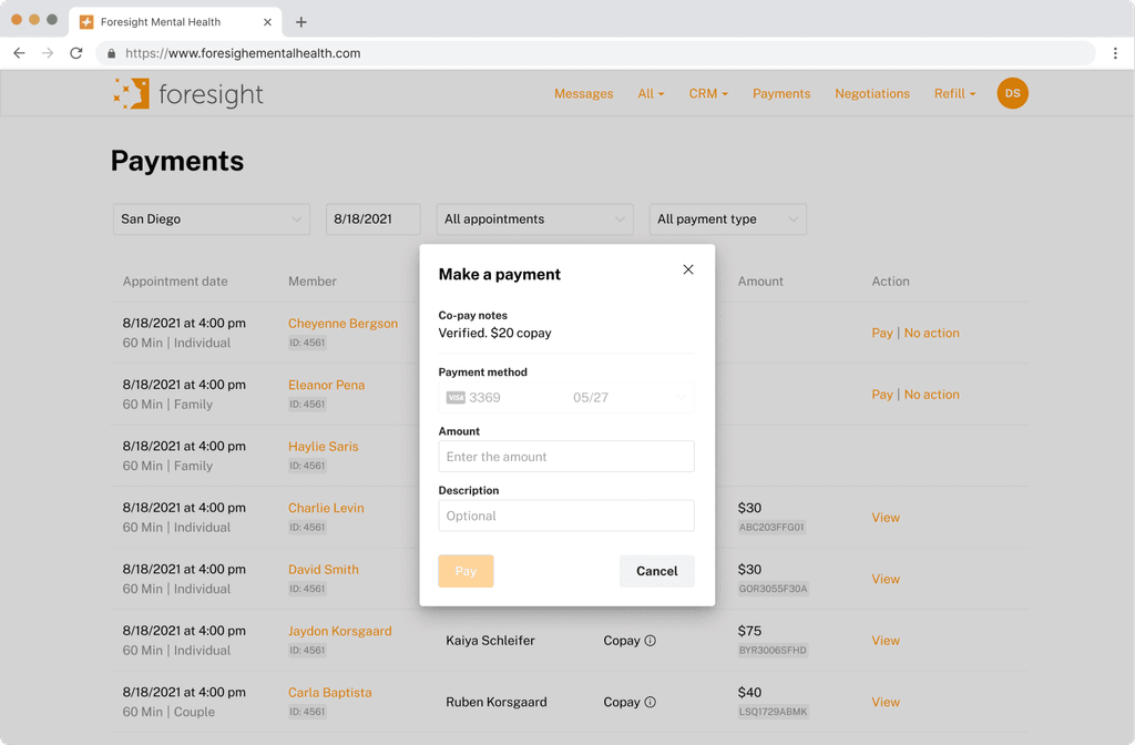
New Payments page
Operators can manage all transactions within one interface
Payment statuses are clearly marked:
‘Pay’ – Requires action
‘View’ – Completed transaction
Tasks can be filtered by location, date, or payment type
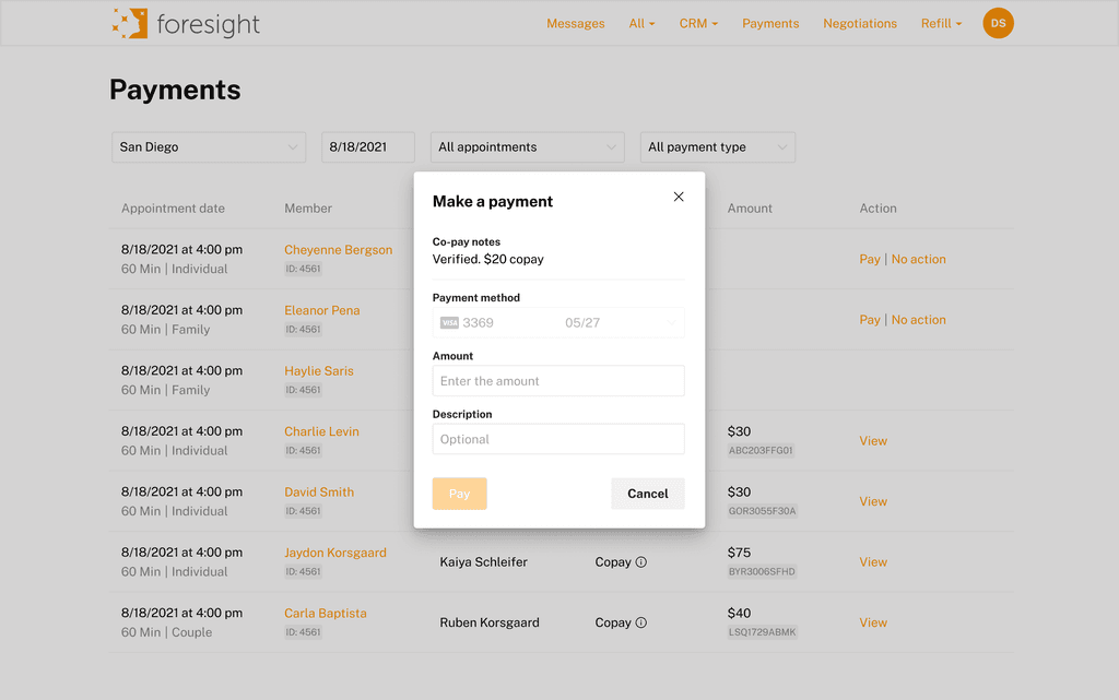
Enhanced payment form
Displays partial credit card info for security
Pre-populates copay notes within the payment form for faster, error-free processing
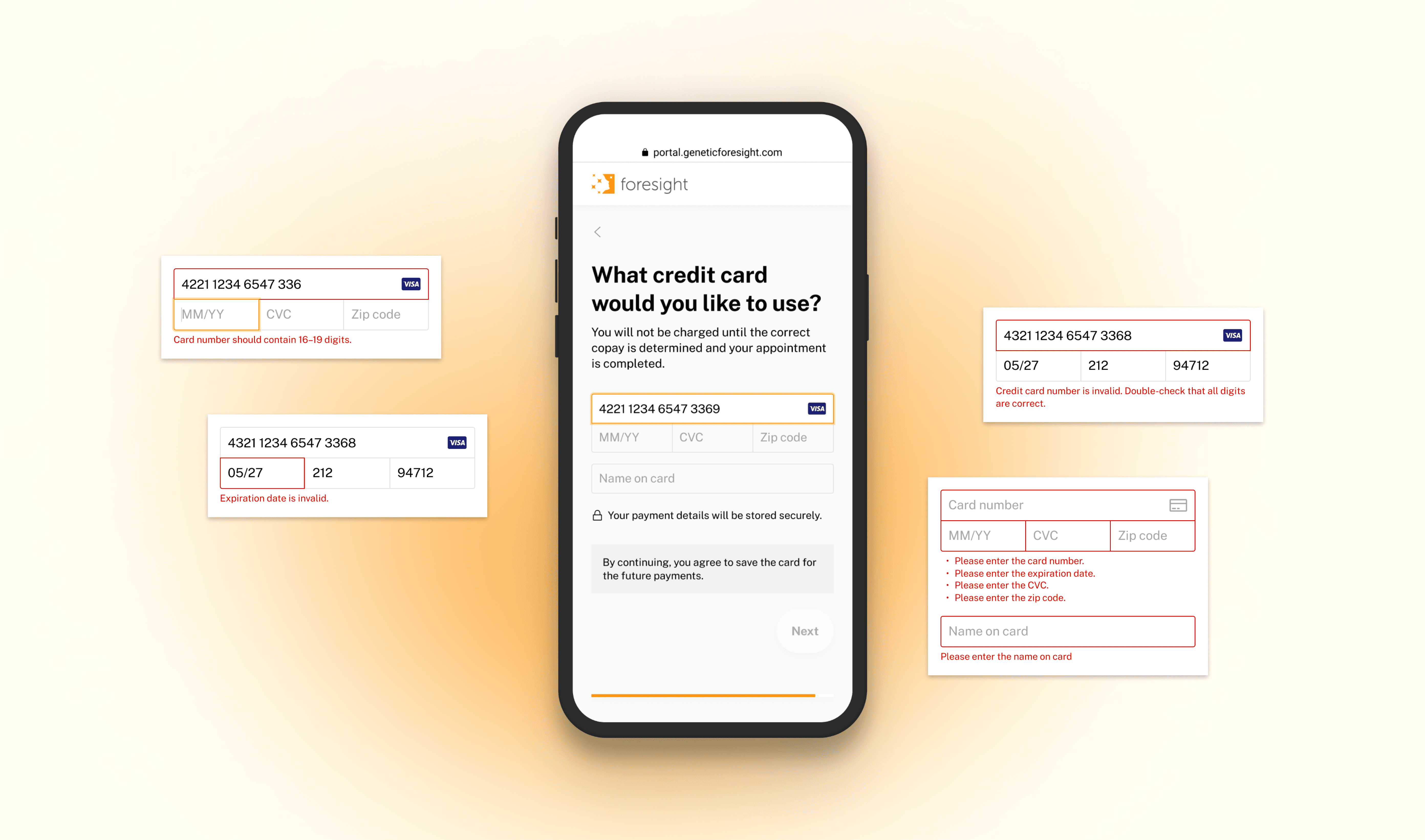
Validates card data in real-time
Business Impact
After all 3 features went live:
revenue
collected within a month of launch on copay alone
of copay collection rate
👇 Step by Step process👇
Here's how it's been done
The chart highlights key milestones from discovery to delivery. Transitioning to Stripe mid-project introduced unexpected challenges, requiring us to pause, reassess, and redesign workflows. This shift addressed technical limitations and security concerns, leading to a more scalable and compliant payment system. By collaborating with stakeholders and refining our approach, we delivered a stronger, more efficient solution. The detour ultimately future-proofed the payment process and enhanced user experience.
User
Billing team members
Process payments for members using provided credit cards, issue receipts, and access payment reports for tracking and reconciliation.
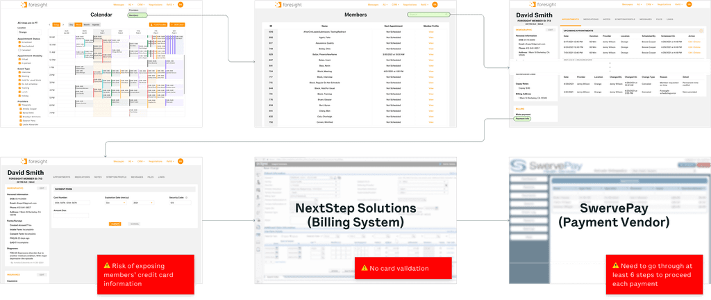
Current workflow
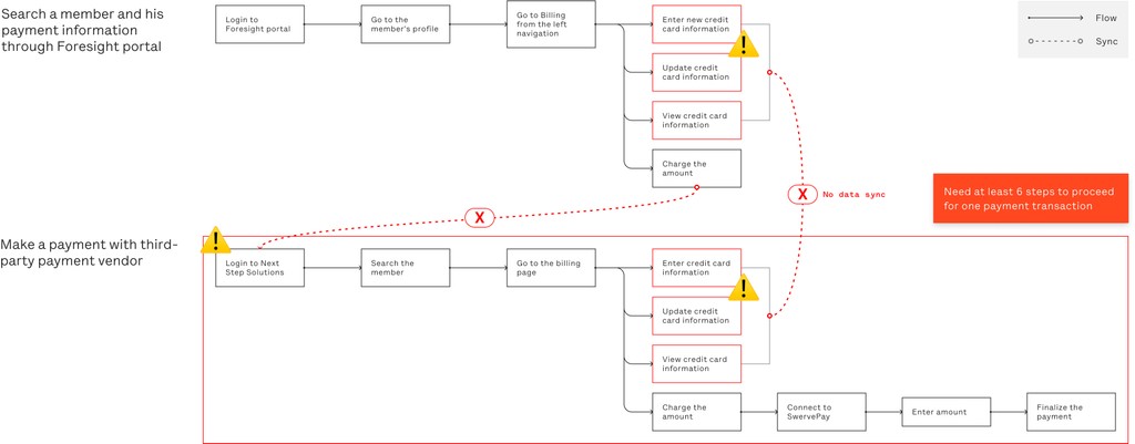
Excessive Manual Steps: Too many steps are required to enter or verify data.
Security Risks: Potential exposure of members’ card information.
Inefficient Process: Requires at least 6 steps to complete a single payment transaction.
Define
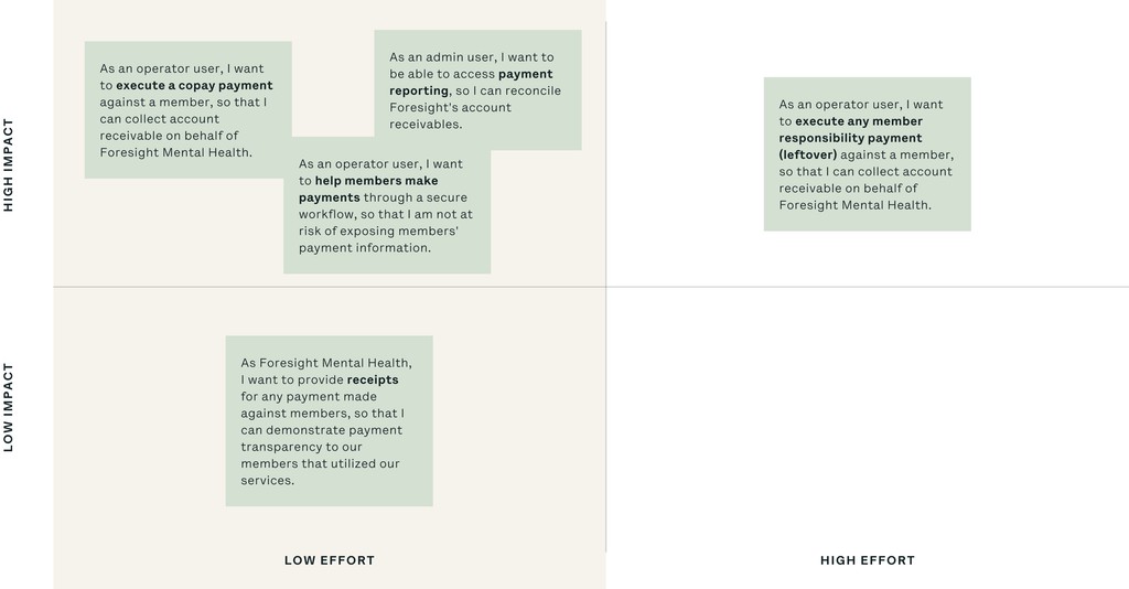
Prioritize use cases
After analyzing various scenarios, we prioritized them in a chart, focusing on member copay as the primary issue—representing about 80% of payment types. Operator feedback during research highlighted copay as the most urgent area, leading us to concentrate on this low-effort, high-impact zone for the project.
Goal
Streamline payment process with Stripe integration to enhance user’s work efficiency.
Workflow explorations
Focused on reducing complexity by creating a more secure and efficient structure with fewer manual steps through Stripe integration.
V1: Utilize the Existing Flow and Page
Description: Integrate the payment feature into the existing member profile page where operators access card information.
What Worked: Familiar interface minimized confusion for users.
What Didn’t: Still requires multiple steps to navigate, resulting in a less streamlined workflow.
V2: Create a Dedicated Payments Page with a New Flow
Description: Design a standalone Payments page accessible from the top navigation menu.
What Worked: Simplified workflow with direct access to payment information. Provided room for future scalability.
What Didn’t: Required additional backend development resources for implementation.
Decision:
We chose V1 for the MVP due to faster implementation, with plans to develop V2 post-launch for long-term scalability.
The following workflow focuses on V2, the dedicated Payments page, designed to streamline operations and improve user efficiency in future phases.
Usability testing
Before designing the Payments page, I engaged with users to gather precise requirements for payment information.
Design Explorations (Iterations 1–3):
Initially, I explored presenting all payment details directly in the table for easy review, but this led to clutter, especially on smaller screens. I then adopted a two-line layout to improve spacing, but evolving requirements from billing specialists reintroduced the need for copay notes and payment transaction details. This resulted in a cramped table and usability issues, as copay notes often contained complex details. Users found it difficult to recall copay amounts when opening the payment form, causing inefficiencies.
Final Iteration (Iteration 4):
Clear display of the copay note
Enhanced ease of information access
I relocated copay notes inside the payment form while keeping payment types and transaction data in the table. This approach enhanced clarity, reduced clutter, and allowed operators to quickly scan tasks while accessing detailed information when needed. Users confirmed the new design improved efficiency and task management.
Final Design
This final design not only improved operator productivity but also enhanced security, reduced processing times, and minimized errors – directly contributing to increased revenue and operational efficiency.
Optimized workflow
Before
Multiple manual steps, required to enter or verify data
High risk of exposing members' card information
Minimum of 6 steps to complete one payment transaction
After
Streamlined workflow reduced from 6 to 2 steps by eliminating manual processes and syncing data
Automated credit card validation to prevent double data entry
Enabled in-portal payment processing for operators
New Payments page
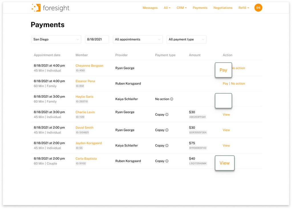
Identify status and process payment
Operators can manage all transactions within one interface
Allows operators to efficiently monitor and process payments with clear status indicators and streamlined actions:
Pay Button – Charge members directly within the portal.
Empty Field – Marks members without copay fees, allowing quick dismissal with "No Action."
View Button – Confirms completed transactions and provides one-click access to Stripe for full payment details.
Tasks can be filtered by location, date, payment status, or type to prioritize workloads.
View payment detail
Essential payment details are accessible through hoverable ‘Info’ icons or by clicking "View" for full Stripe transaction data.
Additional Benefits:
Automated receipts and refunds
Enhanced reporting
Secure, compliant workflows
Enhanced payment form
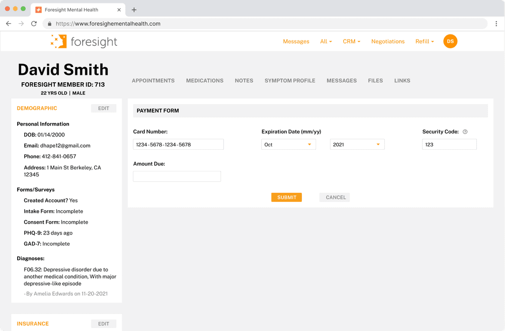
Before
Manual data entry and verification led to inefficiencies
High risk of exposing sensitive credit card data
After
Secure, Clear Process
Payments processed through a locked, secure form
Pre-populates copay notes within the payment form for faster, error-free processing that streamlines the entry process
Partial card details ensure privacy and reduce data exposure
Credit Card Validation
Stripe’s validation process ensures data accuracy
Reduces errors and expedites payment processing
Additional consideration
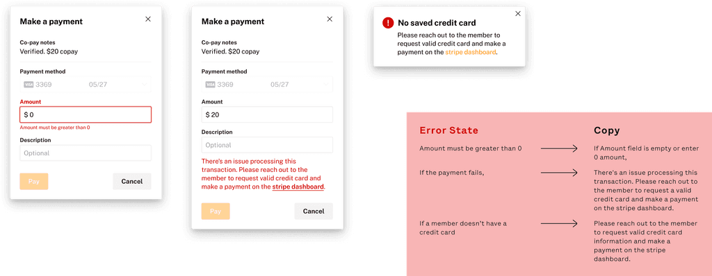
Error copy developments
Why It Started: Error copy development began in response to user challenges – operators often struggled to resolve issues within the payment workflow, such as missing credit card information or failed transactions. Without clear guidance on how to proceed, it causes frustration and delays.
Impact on Product Teams: Error messaging improved user experience and streamlined communication between product teams by clearly defining edge cases and aligning solutions.
What I Did: I developed error messages for issues such as missing credit data and Stripe errors, reducing uncertainty and guiding users with clear next steps. This enhanced workflow clarity minimized downtime, and improved overall efficiency.
Business Impact
After all 3 features went live:
revenue
collected within a month of launch on copay alone
copay collection rate achieved
Learnings
Plan to replan
In any project, unforeseen challenges are inevitable. Our experience highlighted the need for flexibility and the ability to adapt plans as needed. Facing complexities inherent in payment systems, we quickly realized the necessity of agile thinking and the capacity to pivot when obstacles arose. Being prepared to replan enabled us to overcome obstacles more efficiently.
Little details matter
Whether it's the choice of colors, the placement of elements, or the wording of instructions, each detail contributes to the overall user experience. Paying attention to the little details demonstrates a commitment to excellence and user satisfaction. It shows that designers care about every aspect of the user journey and are dedicated to creating intuitive and delightful experiences.

