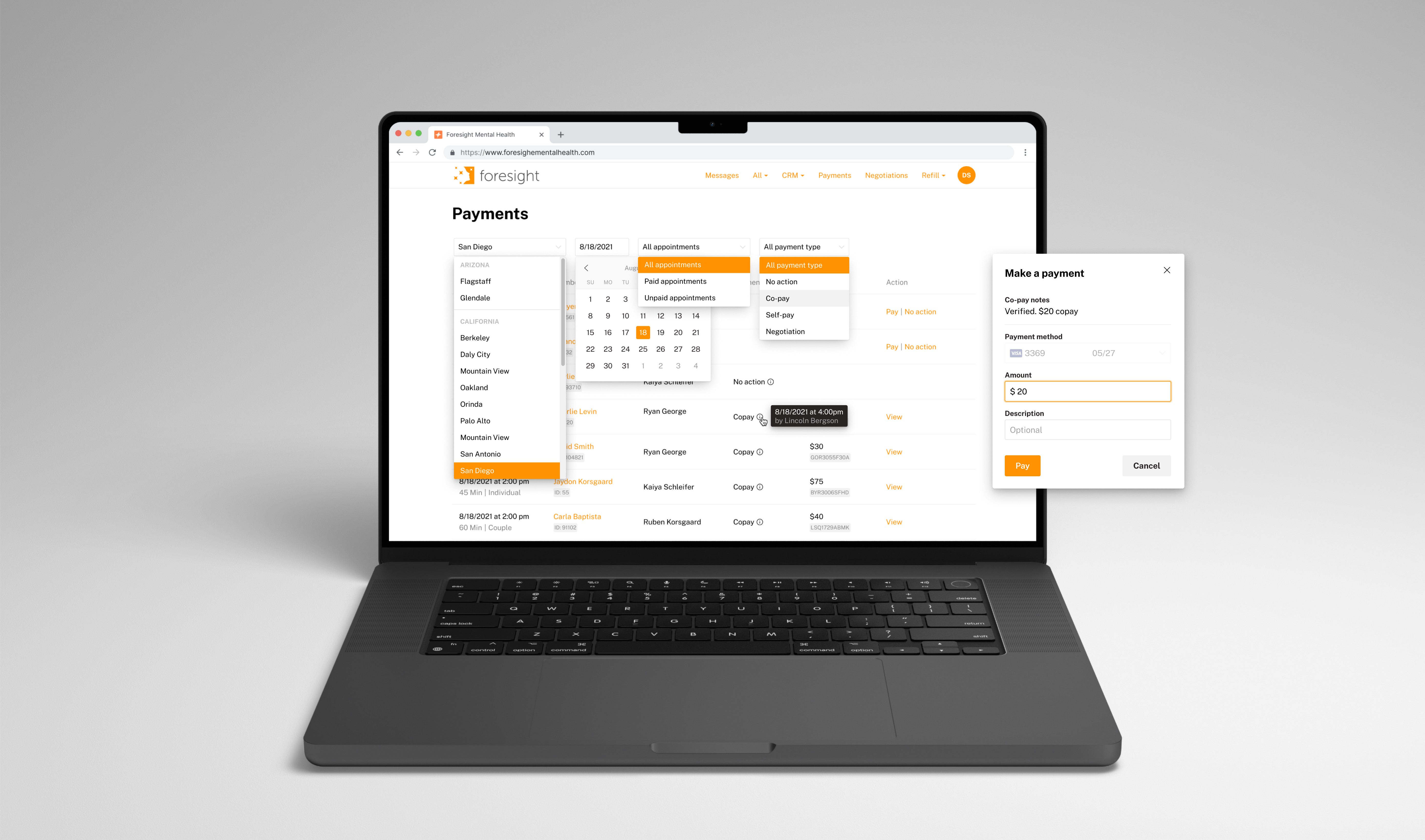
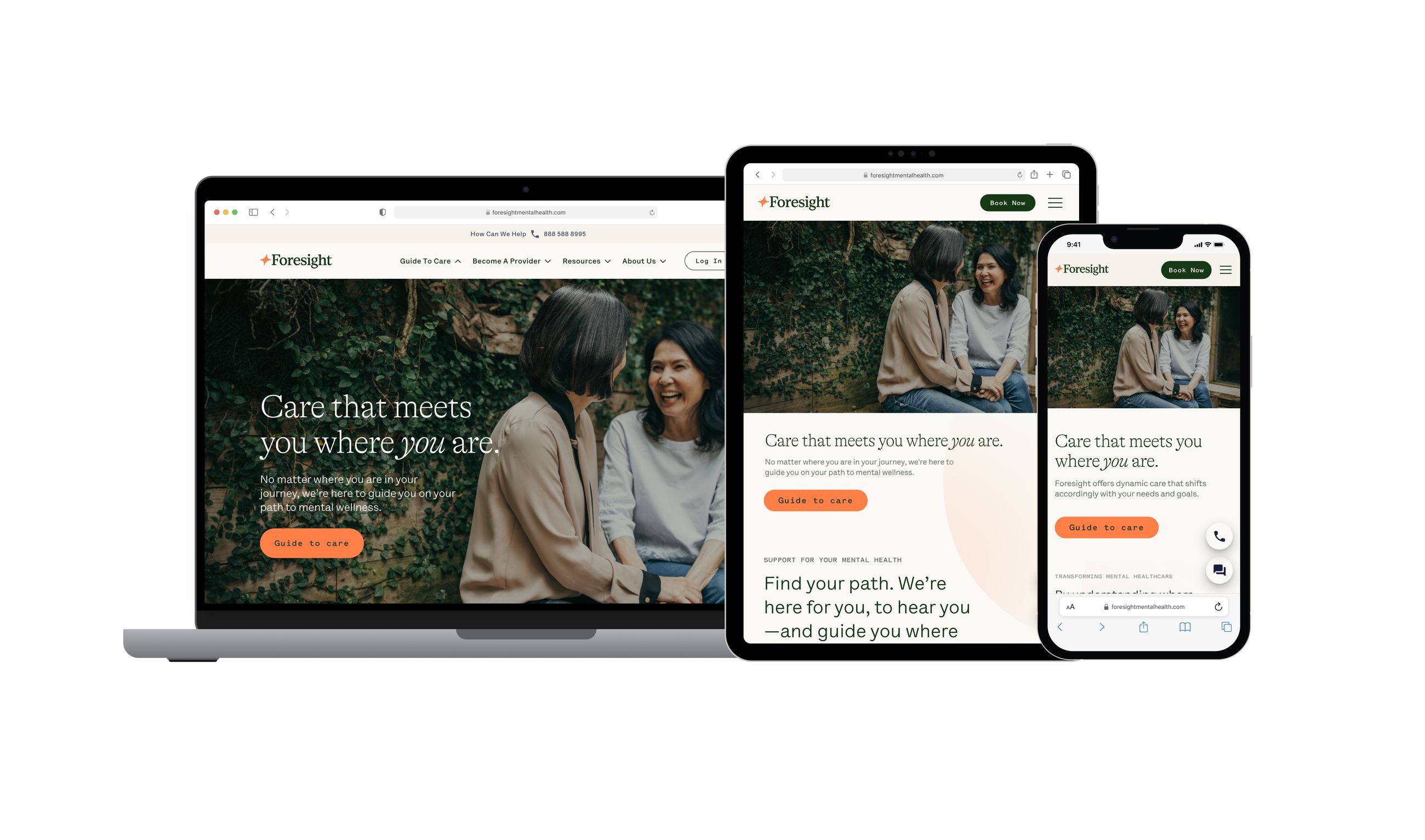
Secure Payment Form
Helping Foresight members to store their payment details securely
My Role
Research, Define problems, Ideation, Wireframing, Prototyping, Visual Design
Team Members
Sr. Product Manager
Front-end Engineer
Back-end Engineer
Duration
6 months
Platform
Mobile
Context
Foresight Mental Health (FMH) is dedicated to leveraging technology to improve mental healthcare and lifestyle. Currently, FMH serves over 10,000 members with recurring revenue. As FMH continues to grow significantly over the coming years, meeting security and compliance regulations will be inevitable.
About
This experience is designed for new FMH members to enter their payment information. It is crucial to make a positive impression on new and potential members with a robust and reliable payment form. Our goal is to build trust with members by enhancing security and reducing uncertainty.
User

New or potential FMH members
who use the app to save their payment information
User Problem
Users feel uncomfortable exposing their payment information and are often confused by uncertain messages and repetitive processes.
Why?
"I don't feel comfortable providing my credit card information over the phone."
"After I saved my card information in my account, I saw the message 'Saved successfully,' but my operator keeps asking me to correct the information."
"An outdated page design feels like a scam."
"I wish I could add multiple payment methods."
"I already filled out my payment information on the first day when I submitted the consent form. So why do I need to re-enter the same information again?"
Business problems
FMH loses members due to diminished trust and a low payment collection rate could put the business at risk.
Revenue leakage and decreased trust
Compliance gaps and data security risks
40% of payment errors caused by manual claim input
Defined current problems
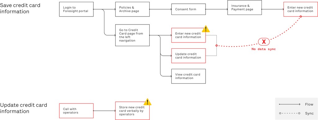
Collecting card info by phone call: Risk of exposing sensitive card information.
No credit card validation: Lack of immediate validation for credit card information increases errors and invalid data entries.
Inaccurate error messaging: Users are not provided with correct error messages when entering invalid card information, leading to confusion and inefficiency.
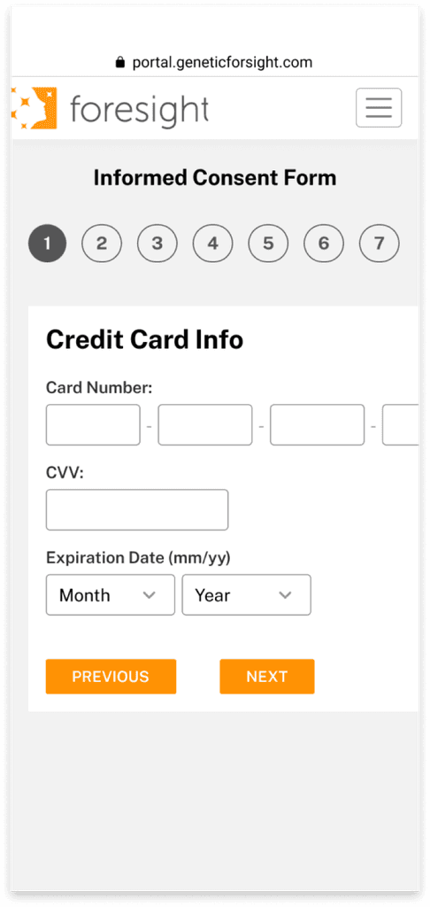
Outdated page design: The design of certain pages is outdated, potentially impacting user experience and perception of the platform.
Market research
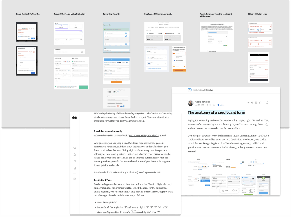
Analyzing existing market products provided valuable insights into prevalent design patterns. This market research was instrumental in identifying key strategies for enhancing the user experience.
Insight #1
Ask for essentials only
Users are more likely to complete a form if it asks for only essential information. Too many fields may deter users from proceeding or completing the form.
Insight #2
Tell users what went wrong
When errors occur, it's crucial to communicate to users what went wrong. Clear error messages help users understand the issue and take appropriate action to resolve it.
Insight #3
Reassure users of security
Users often question the security of online forms, particularly when entering sensitive information like credit card details. Incorporating a security message into the design helps reassure users and build trust in the platform's security measures.
Goal
To build trust with members, enhance security measures by helping them securely save their payment information and streamline user journeys by reducing uncertainty.
Placement
Placement explorations of the new payment form @New Member Booking Flow
The member booking flow allows new members to make appointments independently. We are introducing a new payment page within the existing booking flow. Careful consideration was given to determine the optimal placement for the credit card form within this flow.
Why Option 3?
Option 1: Asking for payment information too early in the process can be off-putting for users.
Option 2: At this stage, users still do not know if they can book a session, leading to potential confusion and frustration.
Option 3: Makes the most sense as it asks for payment information after all other steps are completed, ensuring users are ready and willing to provide their credit card details.
Final Design
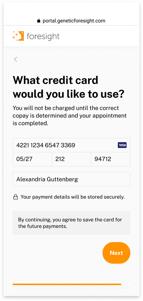
Introduce New Payment Form @New Member Booking Flow
Reduce uncertainty
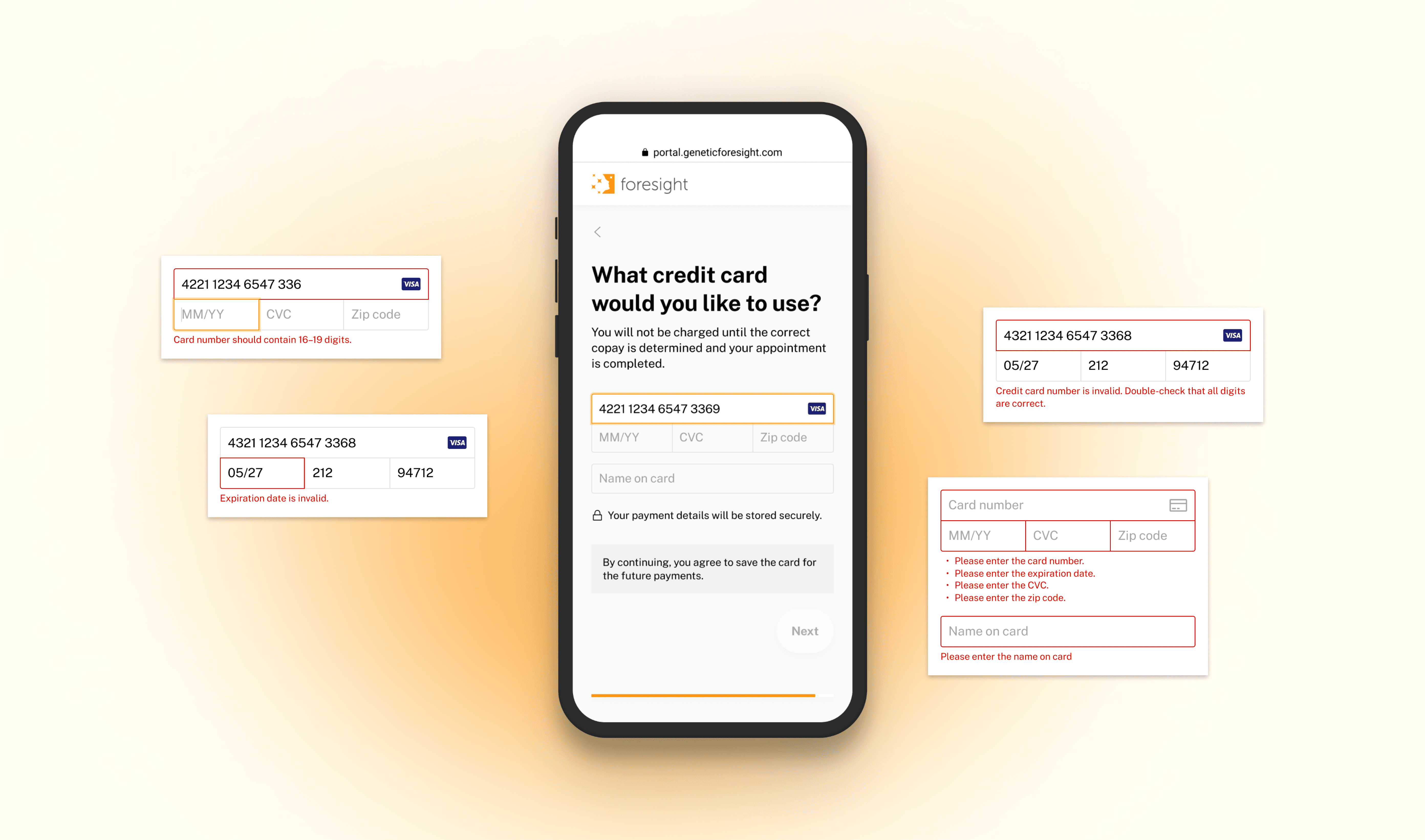
Clearly display charging information at the top of the page to indicate when charges will occur, alleviating member anxiety about uncertainties
Include a security message to reassure members about the safety of their information
Enhance security
Automatically detect and display card type while entering payment details
Provide immediate feedback on any errors that occur and guide users on how to resolve them
Validate credit card data instantly using Stripe Integration to ensure accuracy
Visual enhancements
Streamline user interactions and improve usability by enhancing clarity and responsiveness in design
Align visual consistency with the overall branding and design language of the application
Before
After
Error copy developments
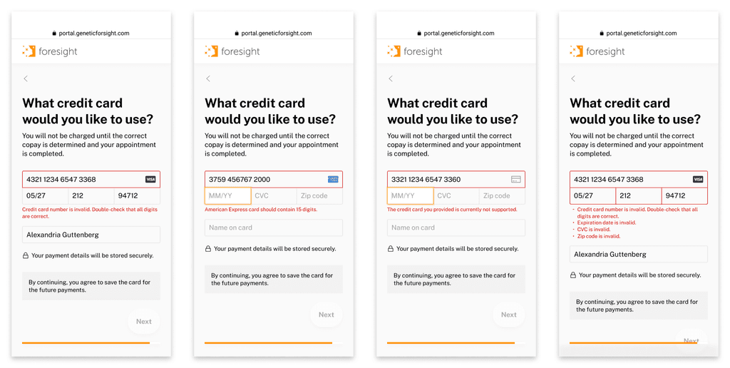
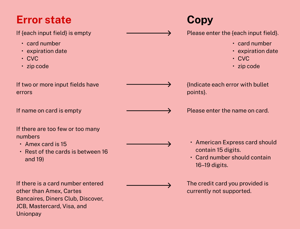
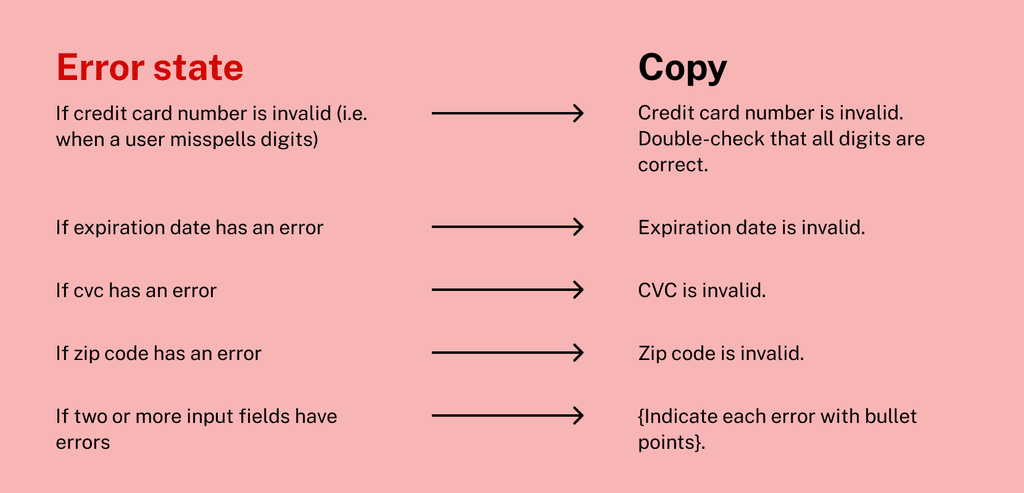
I ensured clarity and guidance by creating clear error messages and screens for edge cases, such as missing credit card information or Stripe connection errors, while designing the pages for each step. My focus was on minimizing uncertainty throughout the payment form and workflow, paying special attention to potential scenarios like the absence of a credit card in the system. Meticulously crafting the error copies for the entire page was essential to provide users with clear direction in navigating these situations.
Input validation error state
Stripe validation error state
Business Impact
After all 3 features went live:
revenue
collected within a month of launch on copay alone
of copay collection rate
Learnings
Design systematically
Designing for scalability and long-term growth is essential in product development. Rather than just adding features incrementally, taking a systematic approach ensures the product can evolve sustainably. By asking strategic questions about future developments and scalability, we can make informed decisions and prioritize features based on user needs and long-term goals.
Opening eye on UX copy
While working on error messages, I learned that clear and tailored UX copy can significantly enhance the user's interaction with the product. It certainly helps make the digital experience more intuitive, reducing friction and aiding users in achieving their goals more efficiently. Plus, empathetic copy builds trust, making users feel understood and supported.
