Website Design | Branding
Website Rebranding
Refresh Content Management System(CMS) website to improve how we communicate and serve our member and provider communities
My Role
Market Research, Sitemap Audit, IA, Wireframing, Prototyping, UI & Visual Design
Team Members
Project Lead
Product Designer
Sr. Copywriter
Visual Designer
Duration
MVP Launch: 3 months
Platform
Web, Tablet, Mobile
Overview
Foresight’s marketing site is a critical component for achieving cross-functional departmental goals and aligning with the company’s mission of expanding throughout the United States to make mental healthcare affordable and accessible. The new content management system (CMS) website will serve as the central platform for the new brand launch, positioning Foresight as a national brand that attracts members, providers, and talent.
User
The website plays a vital role in guiding both prospective members and providers who typically discover us through mental health affiliate platforms like Psychology Today or ZocDoc, or via search engines.
Potential Member

Seeks mental healthcare services and detailed information about Foresight's offerings to make informed decisions.
Potential Provider

Explores clinical career opportunities at Foresight, seeking insights into the company’s mission, values, and benefits.
User Problem
Encountered friction due to unclear navigation, lack of scalability, and failure to reflect the brand's evolving identity, resulting in reduced user engagement.
Discovery & Insights:
Key Challenges
Through stakeholder interviews and analytics audits, we uncovered:
Navigation issues led to user drop-off, especially high drop-off rates on booking pages.
Confusion around call-to-action placements.
73% of site traffic came from mobile, but the experience was subpar.
Limited scalability for new clinic locations and content expansion.
Inconsistent brand voice and outdated design.
Key Metrics
To measure the success, we identified and set clear, actionable targets. These metrics focus on user engagement, performance improvements, and scalability, reflecting the critical areas that needed attention.
Increase new member conversions by 20% post-launch.
Reduce bounce rate by 15% through improved mobile performance.
Implement scalable CMS to support 50+ new clinic locations.
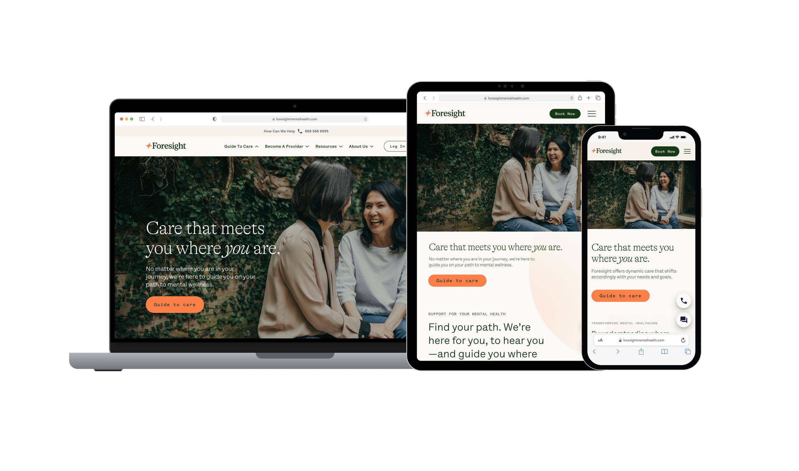
Home page (web)
Information architecture
Current
Audited Existing Sitemap: Identified gaps in user flow and inconsistencies in navigation.
Restructured Navigation: Created a streamlined, user-friendly structure that aligned with mental models of prospective members and providers.
Prioritized CTAs: Placed clear, actionable CTAs at strategic points to guide users seamlessly through key paths—booking, inquiries, and career applications.
Scalable Framework: Built a modular architecture to accommodate future clinic expansions and content growth, ensuring long-term scalability.
Redesigned
The structure of information on the website directly impacts how we deliver information and communicate with each user. Our redesigned approach focused on:
Enhancing website architecture and navigation for clarity.
Developing a scalable site using a headless CMS powered by Material UI React components from the Foresight design system.
Creating a more accessible and engaging interface for users.
Balancing technical constraints with ease of use to ensure a seamless experience.
Goal
Redesign the marketing site to boost engagement, drive national expansion, and improve accessibility for users.
Design Process
Wireframing & Prototyping
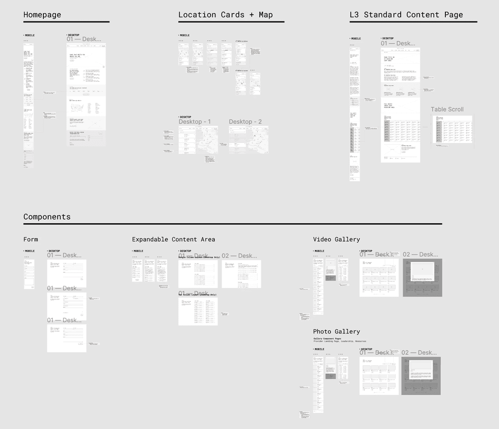
Using the sitemap and research findings, we began constructing wireframes for mobile, tablet, and desktop views. During this phase, we prioritized structure over color, focusing on UI components to envision how the layout might translate to the final design. Collaboration with the marketing team and our agency partner ensured alignment with user needs, business objectives, and technical constraints. These wireframes served as discussion tools to refine the website framework and ensure cohesive navigation.
Component-Based Design
Given the diverse page requirements of the CMS website, we opted for a template and component-based approach. This methodology allows us to establish a system for leveraging various pages and components in future iterations. Central to this process were the user journeys of members and providers, with clear calls-to-action guiding them to book appointments, inquire for more information, or apply for careers.
Final Design
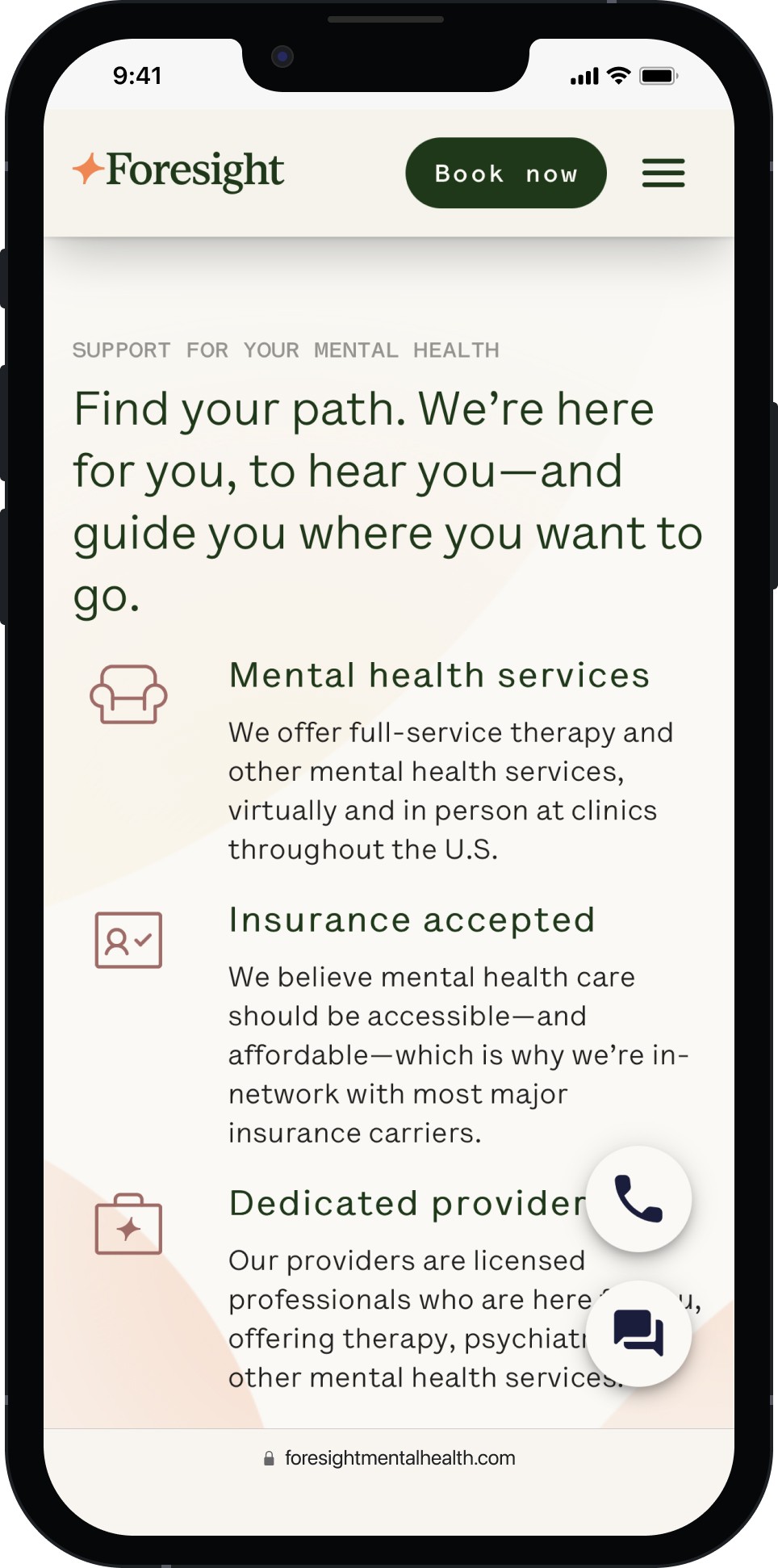
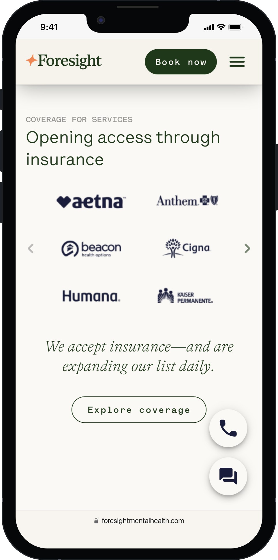
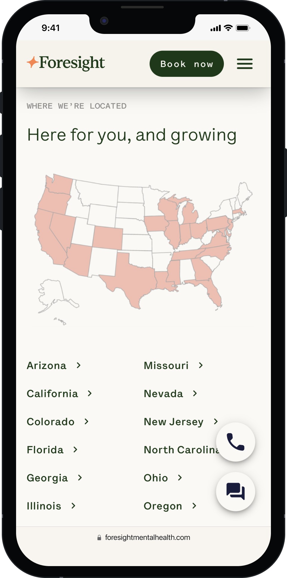
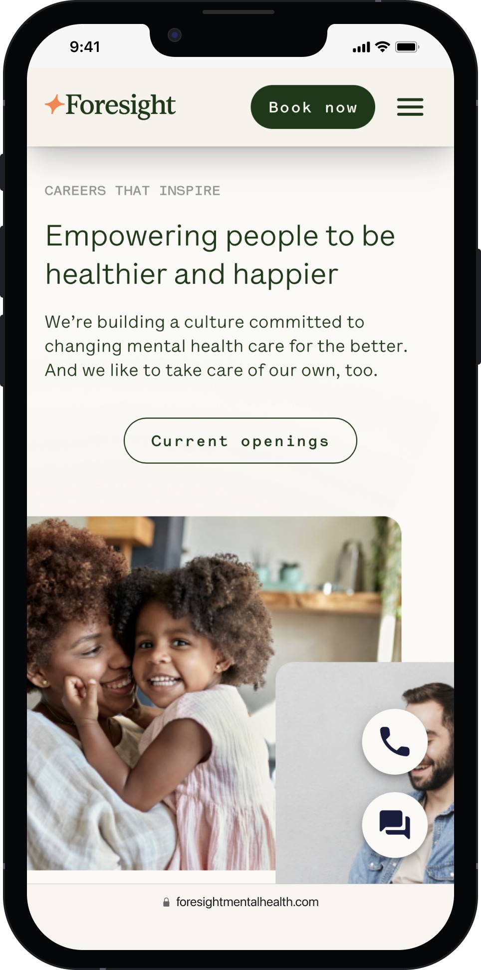
The primary objective of the final UI development was to create a universally functional website across platforms, setting a high standard for quality and positioning Foresight as a tech-forward national brand.
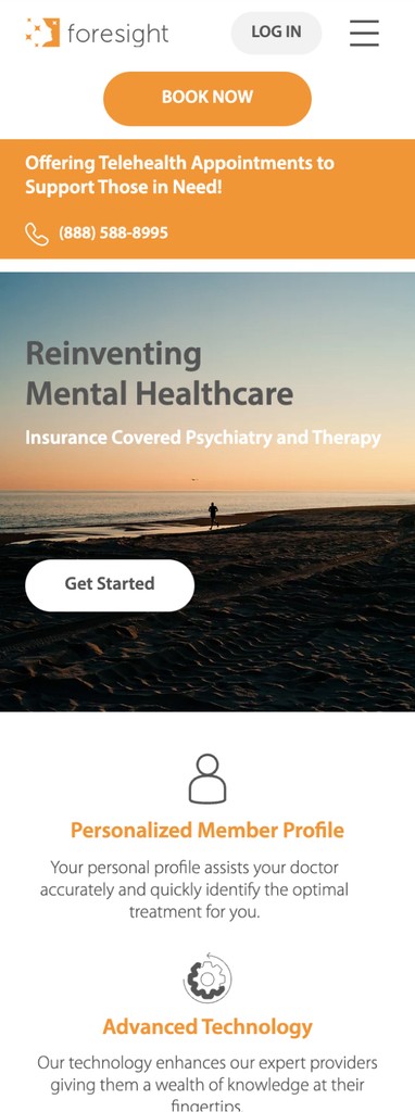
Before
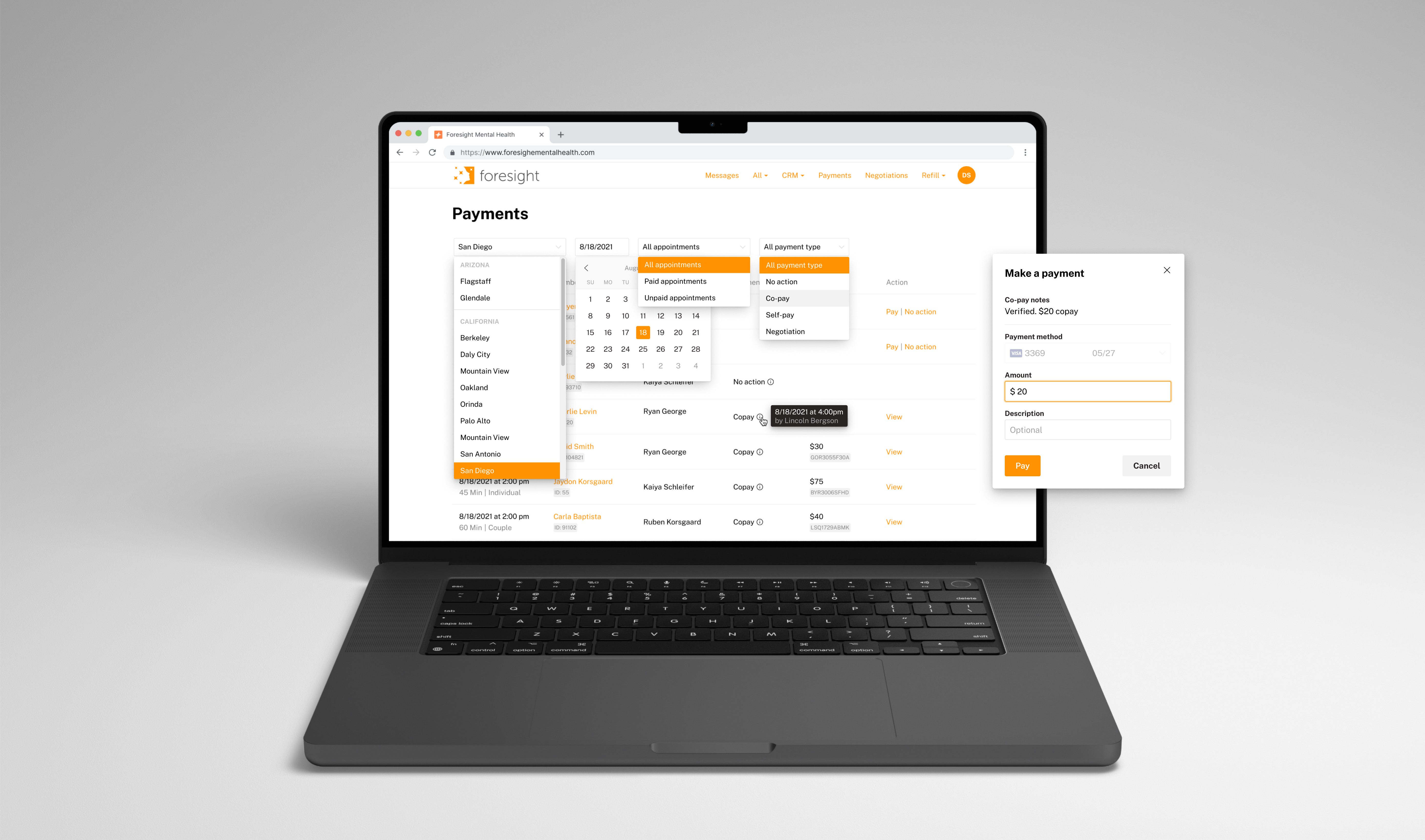
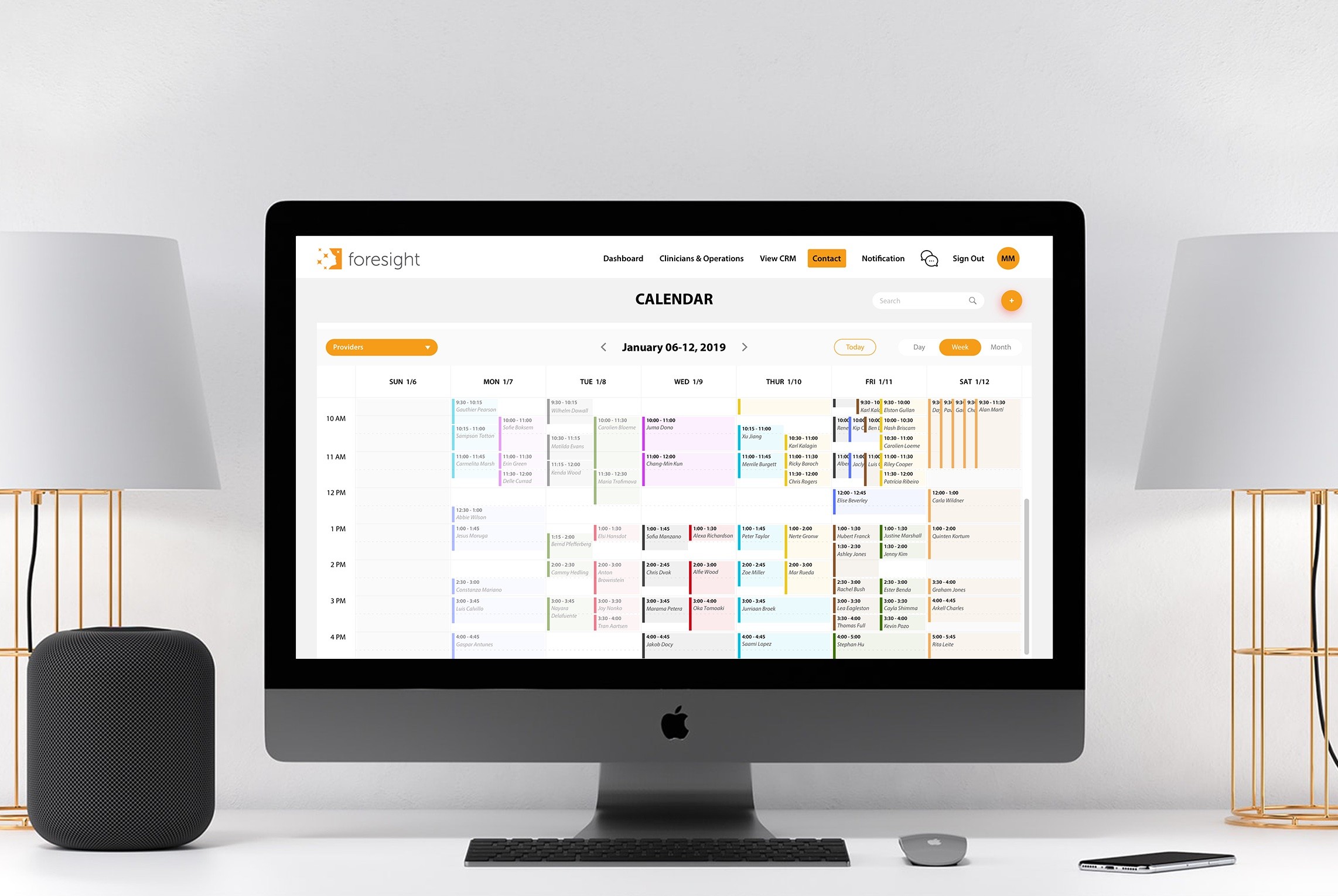
Manual data entry and verification led to inefficiencies
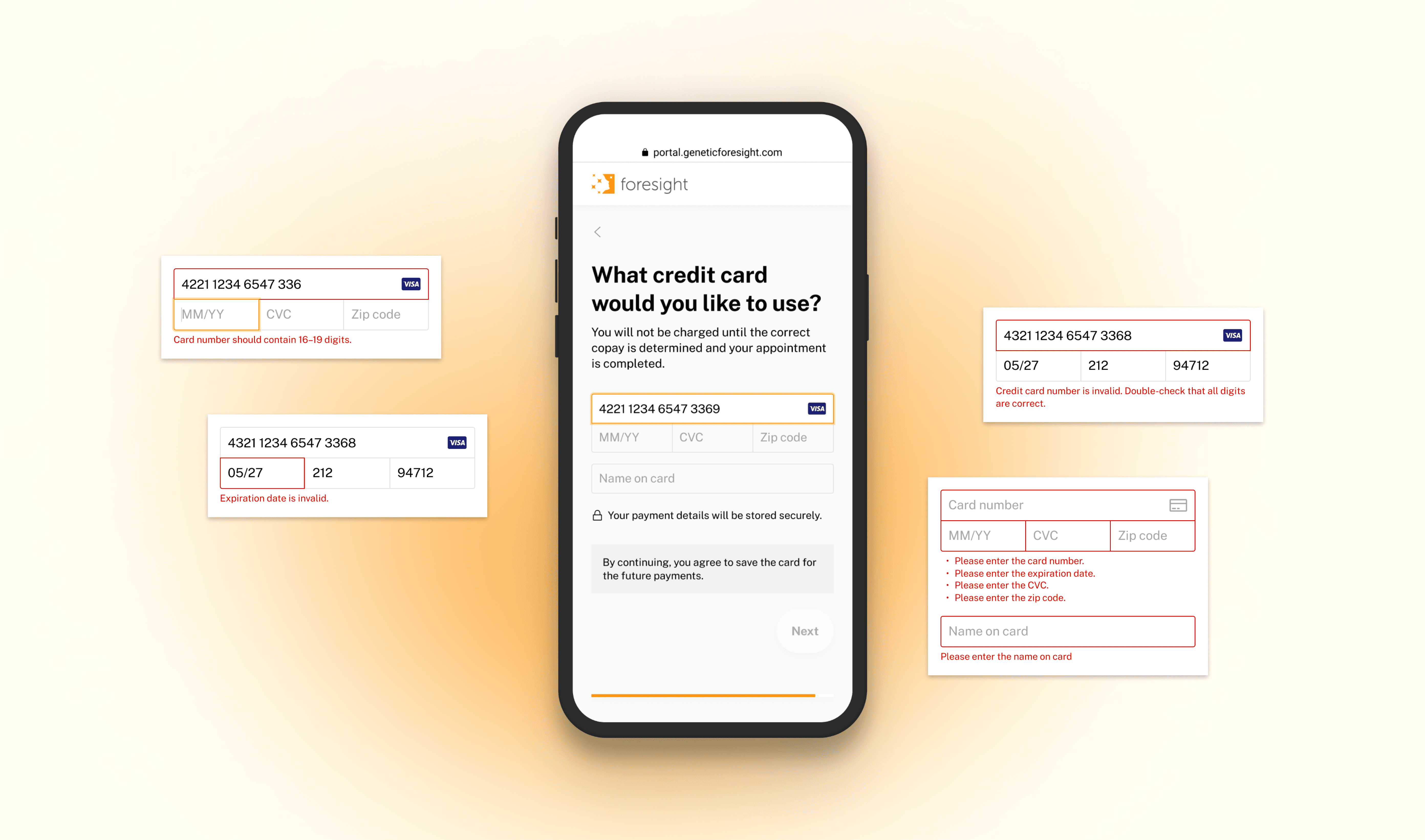
High risk of exposing sensitive credit card data
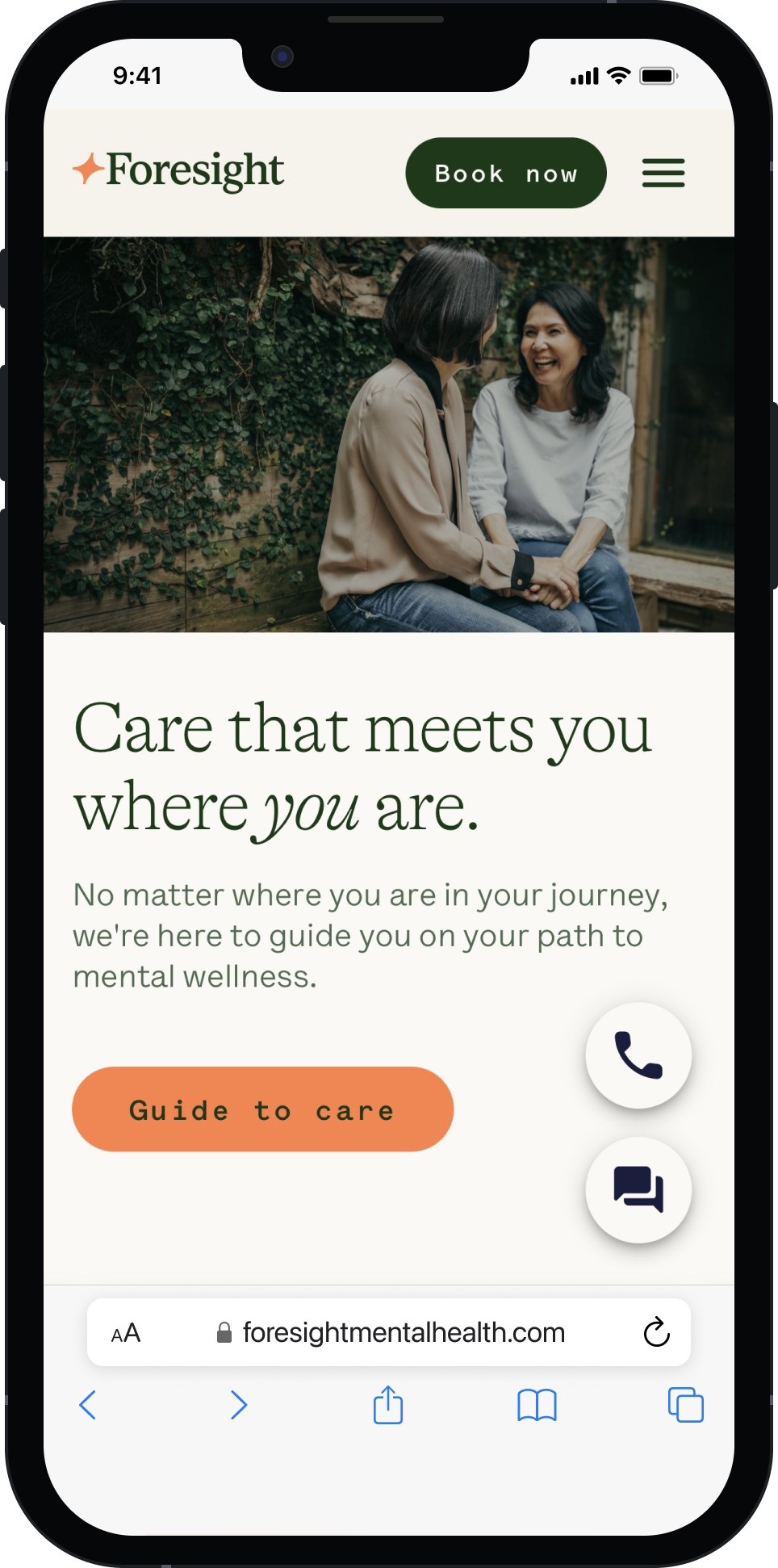
After
Restructure Information Architecture: Audited and redesigned sitemap to simplify navigation and clarify CTAs, directly aligning with user mental models.
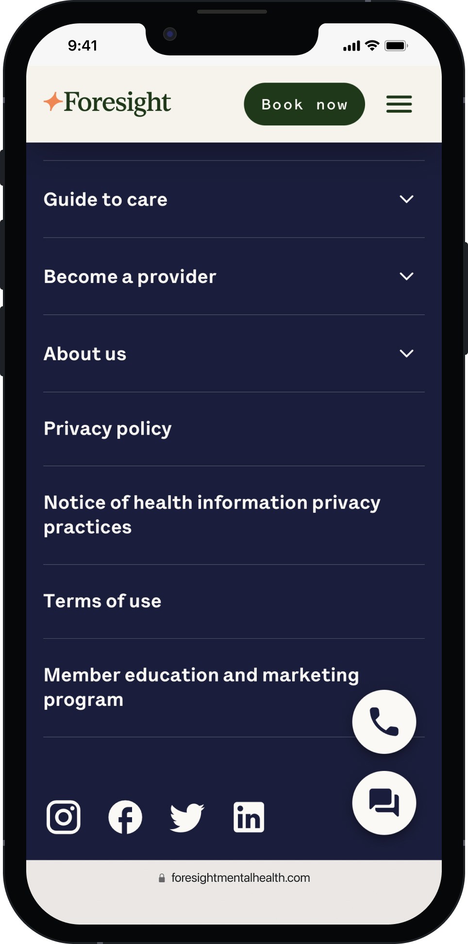
Mobile-First Redesign: Prioritized mobile UX with responsive, fast-loading components optimized for smaller viewports.
Headless CMS Integration: Built a scalable platform using a headless CMS powered by Material UI, enabling flexible content updates and state-by-state expansion.
Enhanced Visual Storytelling: Refreshed UI to better communicate Foresight’s mission and services through consistent branding, accessibility (WCAG 2.1), and engaging design.
Home
Service
Insurance
Location
Career
Footer
Impact
increase
in new member conversions within the first 3 months.
reduction
in bounce rate through improved mobile UX.
locations
supported with the new scalable CMS launched.
